So I'm finally back from my favorite Texas city - Austin! I went down to help my friend paint her new house and do some shopping with her! I must say, I was very impressed with how quickly she chose her paint colors and how spot on we loved them! Probably because I failed when I was trying to choose gray for my house - boo. Paint testers were very much our friends, although the $3 price tag for each was a bit saddening.
Sharky Gray
Elaine started with Martha Stewart's Sharky Gray as her main color. She realized that she wanted something lighter and more of a true gray than the warm sharky that looked beige in certain rooms. So we went back to Home Depot and while I shopped for other things, I told her to go back to the chips and find a shade 1-2 shades lighter than her sharky. She came back with nimbus cloud - beautiful! Very light, true gray! I was so impressed with it that I wanted it for myself!
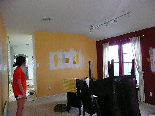
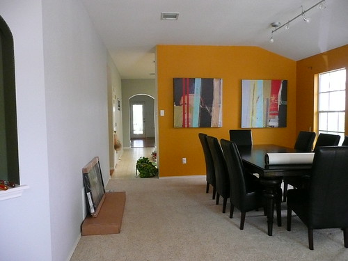
Shadows and diff lighting make the gray very versatile and actually is cooler than warmer. I suggested she bring the gray all the way to the arch in the kitchen and maybe paint the backyard wall in the living room a semi dark color to give a receding effect. The problem is that the room was already naturally dark and she wanted to lighten it as much as possible. We ended up doing two walls in her gray and will do the other walls in a shade lighter. In the dining room she wanted a wow factor on the first wall you see walking in. So she had some great modern canvas art picked out that was really colorful, as well as some bw photographs. We switched out the bw from the focal wall with the colorful pieces and pulled colors from it for paint ideas. She also wanted to make sure the color would make the existing curtains complementary. She ended up choosing Behr's Saffron Strands for her focal wall. I LOVE the rich color and it does so much for the artwork, her dining table/chairs, and other aspects of her room. Such a modern, happy, energetic and comfortable color!


nimbus cloud and saffron strands
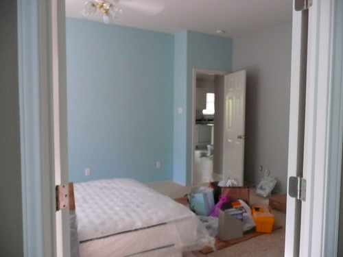
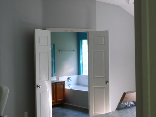
The last color she chose was for an accent wall in her bedroom. She went with Martha's Artesian Well which was a softly bright light blue. It was a bit bright and blue for her so she toned it down with some primer (hehe). Ultimately, she wishes it had a bit more pale green in it like a sea glass blue (we saw a house that had the color she wanted), but it'll do for now! And if she ends up wanting to change it later, she now knows how to do it herself!
Some tips when choosing paint:
* go with testers and test in areas where there are different lighting/shadows
* live with the testers and see it in daylight, nighttime, with lighting, etc.
* walls are best painted in an eggshell or flat finish; it gives richness and depth. Any other finish will appear too shiny and make your house look like you didn't know what you were doing, and not to mention shiny can sometimes look cheap :)
* ceilings are always painted with a flat finish. Different builders use different "white paint" for ceilings so hopefully you have a can leftover in the garage that you can try to color match, or like Elaine just paint over it all with a beautiful brighter white!
* label your paint cans with what room you used them in for both yourself and any other owners that come after you. (I can't remember what my paint color is now and it's driving me nuts!!!) Or you can write the brand and paint name on a piece of tape and place it behind your light switches.
Elaine's paint wishes:
- airy, brighter feel, neutral, gray, pops of color
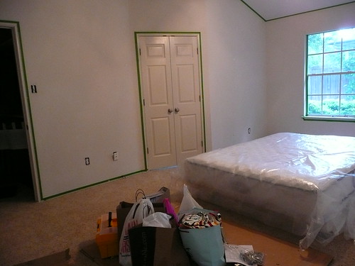
Before
You can see the gray in the kitchen
can you spot saffron strands on the wall?
After
amazing what a deeper shade will do!
sigh, this color makes me happy - she gets GREAT morning light... for about an hour :)
How do you think she did? I would say stop by her blog and drop her a comment, but she doesn't have one so comment here! We've been talking about blogging together with a focus on interiors, styling, and food, so you just might see her on here soon! In fact, I'm going to call her right now to get on that! :) Nothing like working with someone you love on something you both looooove!