i need a project - i'm so freakin bored outta my mind!!!
xoxo, isabel

June 29, 2010
i heart EmersonMade.

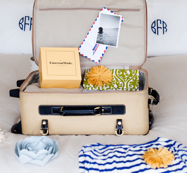

i want.

June 28, 2010
Choosing Paint - Elaine's House
So I'm finally back from my favorite Texas city - Austin! I went down to help my friend paint her new house and do some shopping with her! I must say, I was very impressed with how quickly she chose her paint colors and how spot on we loved them! Probably because I failed when I was trying to choose gray for my house - boo. Paint testers were very much our friends, although the $3 price tag for each was a bit saddening.

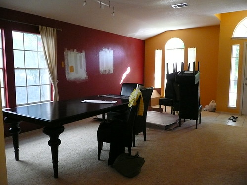
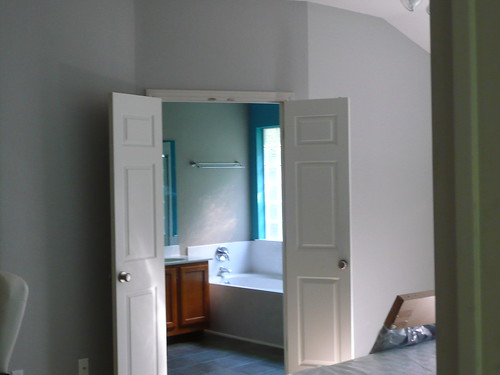
Elaine started with Martha Stewart's Sharky Gray as her main color. She realized that she wanted something lighter and more of a true gray than the warm sharky that looked beige in certain rooms. So we went back to Home Depot and while I shopped for other things, I told her to go back to the chips and find a shade 1-2 shades lighter than her sharky. She came back with nimbus cloud - beautiful! Very light, true gray! I was so impressed with it that I wanted it for myself!
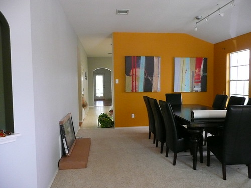
Shadows and diff lighting make the gray very versatile and actually is cooler than warmer. I suggested she bring the gray all the way to the arch in the kitchen and maybe paint the backyard wall in the living room a semi dark color to give a receding effect. The problem is that the room was already naturally dark and she wanted to lighten it as much as possible. We ended up doing two walls in her gray and will do the other walls in a shade lighter. In the dining room she wanted a wow factor on the first wall you see walking in. So she had some great modern canvas art picked out that was really colorful, as well as some bw photographs. We switched out the bw from the focal wall with the colorful pieces and pulled colors from it for paint ideas. She also wanted to make sure the color would make the existing curtains complementary. She ended up choosing Behr's Saffron Strands for her focal wall. I LOVE the rich color and it does so much for the artwork, her dining table/chairs, and other aspects of her room. Such a modern, happy, energetic and comfortable color!


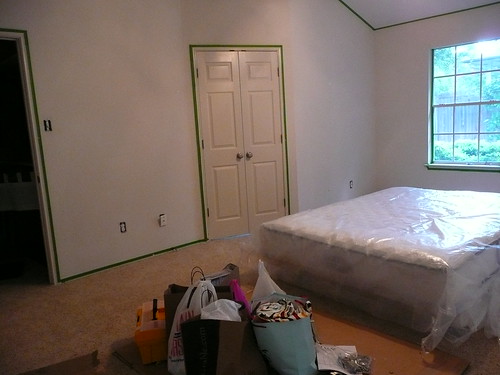
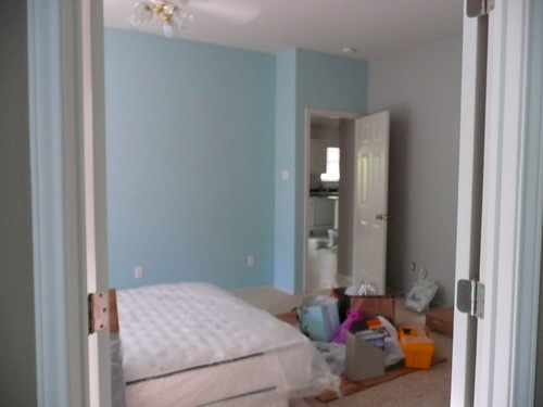
The last color she chose was for an accent wall in her bedroom. She went with Martha's Artesian Well which was a softly bright light blue. It was a bit bright and blue for her so she toned it down with some primer (hehe). Ultimately, she wishes it had a bit more pale green in it like a sea glass blue (we saw a house that had the color she wanted), but it'll do for now! And if she ends up wanting to change it later, she now knows how to do it herself!
 Some tips when choosing paint:
* go with testers and test in areas where there are different lighting/shadows
* live with the testers and see it in daylight, nighttime, with lighting, etc.
* walls are best painted in an eggshell or flat finish; it gives richness and depth. Any other finish will appear too shiny and make your house look like you didn't know what you were doing, and not to mention shiny can sometimes look cheap :)
* ceilings are always painted with a flat finish. Different builders use different "white paint" for ceilings so hopefully you have a can leftover in the garage that you can try to color match, or like Elaine just paint over it all with a beautiful brighter white!
* label your paint cans with what room you used them in for both yourself and any other owners that come after you. (I can't remember what my paint color is now and it's driving me nuts!!!) Or you can write the brand and paint name on a piece of tape and place it behind your light switches.
Elaine's paint wishes:
- airy, brighter feel, neutral, gray, pops of color
Before
After

How do you think she did? I would say stop by her blog and drop her a comment, but she doesn't have one so comment here! We've been talking about blogging together with a focus on interiors, styling, and food, so you just might see her on here soon! In fact, I'm going to call her right now to get on that! :) Nothing like working with someone you love on something you both looooove!

Sharky Gray
Shadows and diff lighting make the gray very versatile and actually is cooler than warmer. I suggested she bring the gray all the way to the arch in the kitchen and maybe paint the backyard wall in the living room a semi dark color to give a receding effect. The problem is that the room was already naturally dark and she wanted to lighten it as much as possible. We ended up doing two walls in her gray and will do the other walls in a shade lighter. In the dining room she wanted a wow factor on the first wall you see walking in. So she had some great modern canvas art picked out that was really colorful, as well as some bw photographs. We switched out the bw from the focal wall with the colorful pieces and pulled colors from it for paint ideas. She also wanted to make sure the color would make the existing curtains complementary. She ended up choosing Behr's Saffron Strands for her focal wall. I LOVE the rich color and it does so much for the artwork, her dining table/chairs, and other aspects of her room. Such a modern, happy, energetic and comfortable color!


nimbus cloud and saffron strands

* go with testers and test in areas where there are different lighting/shadows
* live with the testers and see it in daylight, nighttime, with lighting, etc.
* walls are best painted in an eggshell or flat finish; it gives richness and depth. Any other finish will appear too shiny and make your house look like you didn't know what you were doing, and not to mention shiny can sometimes look cheap :)
* ceilings are always painted with a flat finish. Different builders use different "white paint" for ceilings so hopefully you have a can leftover in the garage that you can try to color match, or like Elaine just paint over it all with a beautiful brighter white!
* label your paint cans with what room you used them in for both yourself and any other owners that come after you. (I can't remember what my paint color is now and it's driving me nuts!!!) Or you can write the brand and paint name on a piece of tape and place it behind your light switches.
Elaine's paint wishes:
- airy, brighter feel, neutral, gray, pops of color
Before
You can see the gray in the kitchen
can you spot saffron strands on the wall?
can you spot saffron strands on the wall?
After
amazing what a deeper shade will do!
sigh, this color makes me happy - she gets GREAT morning light... for about an hour :)
June 16, 2010
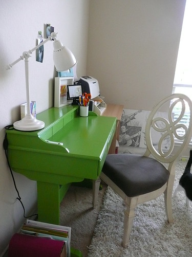
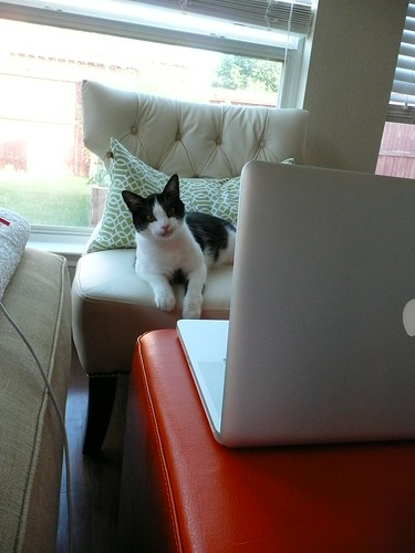
Mini Office
Here's my "normal" office that I really do not use very often. I cheated and put in a nicer chair just for the picture - don't judge :) My green desk makeover sits happily here, but I'm tempted to boot it over to the window once the couch leaves.

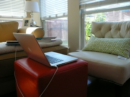
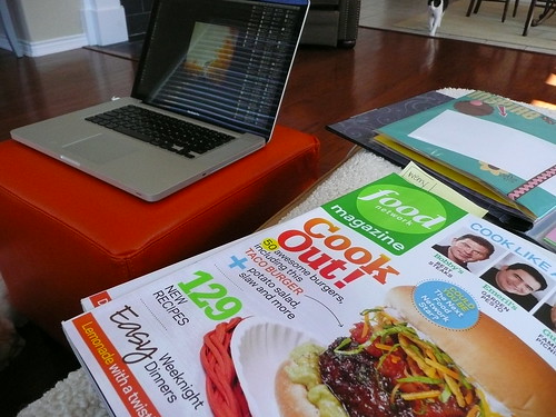
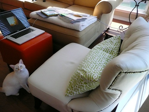
Most days though, my "office" is in the living room! (the joys of owning a laptop!) Today, it looked like this:

xoxo,
Isabel
Most days though, my "office" is in the living room! (the joys of owning a laptop!) Today, it looked like this:
My lovely assistant, Miss Springsteen
Happily blogging now! See?
* I'm off to Austin tomorrow to help my bestie with her new house! I'm pretending it's like my first design job! We're only painting, but still! I hope to do lots more while I'm there!
xoxo,
Isabel
June 15, 2010
Stealing Headboards
ok, not really stealing them, but stealing the look and construction of headboards because I want to make my own! I'm not willing to shell out $400+ for headboard and another $400+ for the rest of the frame. No thanks.
I used to think I would go for an ornate, loopy shape like these:


: tufting : check!
: shapely : check!
: plushy : check!
: stylish : check!
: feminine : check!
: unique : check!
: neutral : check!
: flexible : check!:
: and a major dose of masculine for the man : check!
: diy-able? : chhhheck?
How would you even make this?!? I'm thinking do the border and tufting portion first as one piece and have it stapled where the scrollwork is. I would take out foam/batting where the scrollwork is. Add buttons for tufting, then place the scrollwork on to cover the staples and use the nailheads to cover scrollwork messiness. Corners will take some work!
I still love those ornate headboard shapes - I can't decide!
I used to think I would go for an ornate, loopy shape like these:


all via Beach Bungalow 8
* I really like the naked one! Hmmm...plus the J.Adler and Nate Berkus'...sigh!
*Grace, you are amazing, can I be you?
*sigh, i adore this room every time!
House Beautiful
House Beautiful

Nate Berkus found @ So Haute
I also like rectangular frames - but not as much.
*Good templates to try yourself!
But then I found THIS - yeah, take a moment - and I LOVE!
: tufting : check!
: shapely : check!
: plushy : check!
: stylish : check!
: feminine : check!
: unique : check!
: neutral : check!
: flexible : check!:
: and a major dose of masculine for the man : check!
: diy-able? : chhhheck?
How would you even make this?!? I'm thinking do the border and tufting portion first as one piece and have it stapled where the scrollwork is. I would take out foam/batting where the scrollwork is. Add buttons for tufting, then place the scrollwork on to cover the staples and use the nailheads to cover scrollwork messiness. Corners will take some work!
I still love those ornate headboard shapes - I can't decide!
June 14, 2010
Where to Begin?!
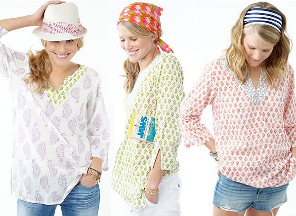
I want all three to be my color palette for my house! I really adore all of them, but I think the last one is too pink for interiors, so I'll go with the first! This is when I wish our couch was white, light, or gray instead of dark tan - bleh.
After reading Julie's post on where to begin when designing, let's talk about why I like them!
* COLORFUL but not overwhelming
* classy, a bit of that country/coastal/beachy but can easily be glamourized
* graphic prints and patterns that are refreshing yet somewhat timeless
* breezy, effortless, comfortable but packed with style
* lots of white!
* it screams happy to me too :)
* playful, modern, bright, grounded
* alright...the more I look at it, the more country it's getting and I'm not liking that look for my interiors...
2. figure out your foundation colors and your pops

3. find pieces that have one adjective and one color. So I'm thinking lots of white - it really shouldn't be a pop, it should be a foundation color so maybe white sheer curtains with one of the tops as a window shade or side stripe on the curtain. definitely patterned pillows in these colors, and a navy tufted ottoman that will serve as a coffee table.


Rickshaw by hydrangea on Polyvore.com
what do you think? too much? too childish? not elegant enough?
Finding Treasure
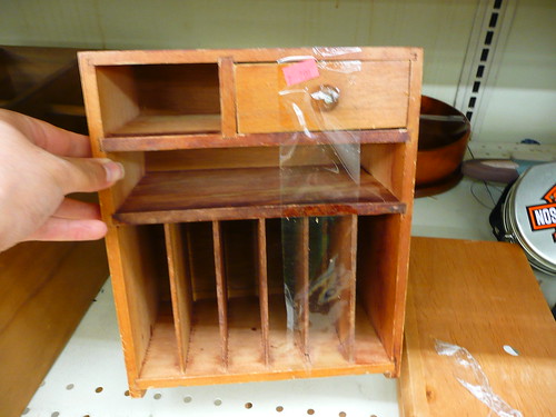
{ Cute organizer for a desk! Picture it painted glossy with a cute pattern/color lining the inside.}

{These would look great sprayed silver or oil rubbed bronze and installed as vanity mirrors. Add iron tilting hardware and bea-ut!}
{I picture this glossy red. or turquoise. maybe yellow with glass knobs. I would also paint the recessed panels a darker shade. Not for $180 though.}
{blurry and sold. not bad. hate the hardware...}

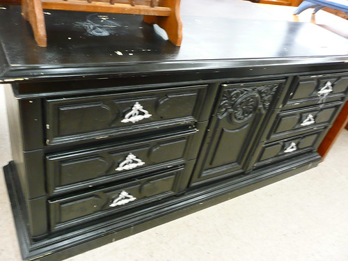
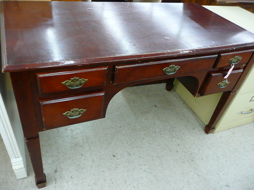
{ Potential vanity. Replace the fan drawer with a plainer front, change out the hardware, paint, add a carrera marble top and done!}

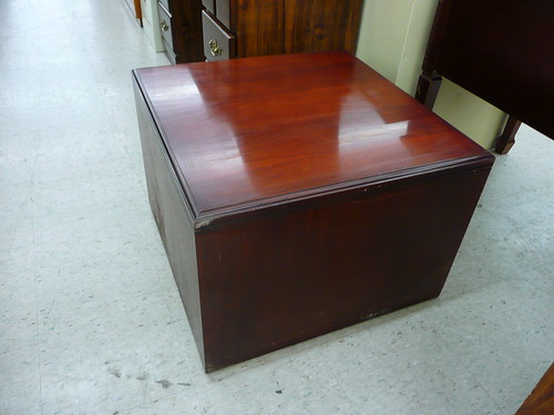
{Decent nightstand I thought! But I didn't want to pay $35 for it}
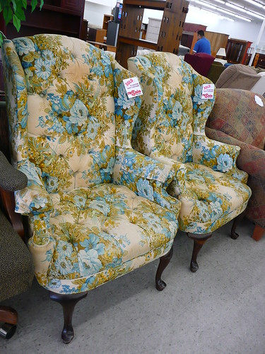
{I thought about upholstering this in velvet and tufting it :). It's too small for my giant couch though}

{West Elm Parsons look-a-likes right?? RIGHT! Add some wood to make the legs taller, screw them together, lacquer it, and you got yourself a double parsons fit for an office!}
{Not so bad looking}
{Someone is using these somewhere - sold}

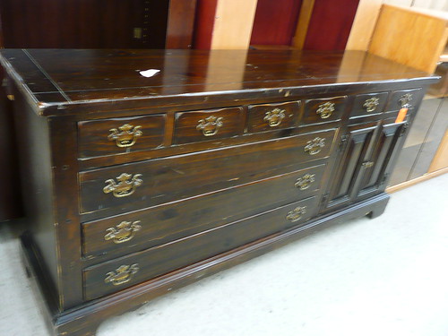
{Take off the doors to reveal shelves, change the hardware to Anthro knobs or horizontal pulls, restain it, what do you think?}

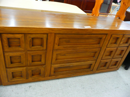
{What a great kitchen island!! Or craft table! This piece is SOLID and beautiful!}
Is the design world tricking me into thinking these are great pieces? Cuz sometimes, I don't trust what I'm imagining...maybe they are just straight up U-G-L-Y? Anybody? Well, I walked out with none of them, but some of these! :)
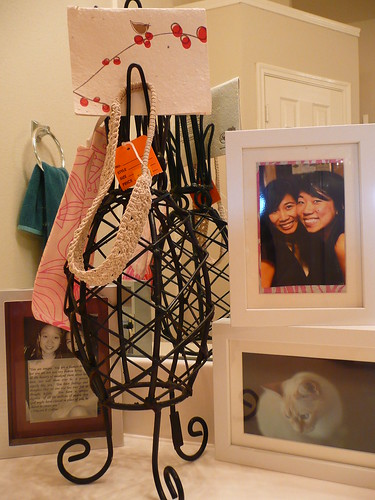
{an iron pineapple that I turned into an accessory/card stand $5}
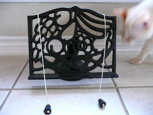
{a beautiful iron cookbook stand, adjustable, with weights! $10}
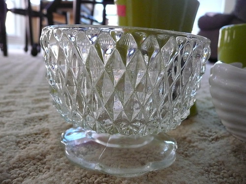
{glass textured bowl $0.50}

{a new tool tin $0.50}

{vases/new sponge holder $0.50 each}
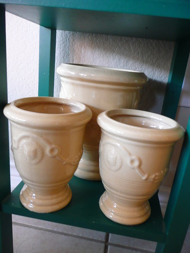
{urns - will change the color - $0.50-$1.00}
Subscribe to:
Posts (Atom)